Vertically center one or more lines of text with CSS. The old and the new way.
Aligning text on the vertical center of a div element is a task we do every once in a while when we style our web applications. Moreover, we have to support more than one lines of text. With the introduction of the display: flex property this task has become a one-line case. However, there are still plenty of browsers, even newer ones, which still do not support this property. Here you can find the browser support for display: flex.
The display: flex approach
We first examine the flex solution. Consider the following div element. We want to Vertically center its content:
<div class="box1">
    lorem ipsum
</div>
The box has the following styling:
.box1 {
    width: 300px;
    height: 60px;
    background: red;
    overflow: hidden;
}
If we want to apply the display: flex property then the solution to our problem is straightforward. We add the align-items: center property and the text is directly centered in the middle of the box:
.box1 {
    width: 300px;
    height: 60px;
    background: red;
    display: flex;
    align-items: center;
}
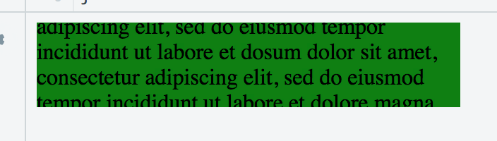
The problem with the flex solution is that if the text gets to long and needs more height than the available height of the parent element, then we get such representation
Non-flex approach for vertically centering text
We now consider the non-flex approach. We first use the line-height property and set it to be the same as the height of div:
.box1 {
    width: 300px;
    height: 60px;
    background: red;
    line-height: 60px;
    overflow: hidden;
}
This will work for one line of text, but what happens if the text is longer? Since the line-height is the same as the height of the div, only the first line of text is going to be shown inside the div. The remaining lines are going to overflow underneath. We could use overflow-y: hidden to hide the extra lines, but this is not the optimal solution. To solve this problem we have to put the text inside another wrapper element. In our case we use a span with a CSS class.
<div class="box1">
    <span class="text">
        Lorem ipsum dolor sit amet, consectetur adipiscing elit, sed do eiusmod tempor incididunt ut labore et dolore magna aliqua.
    <span>
</div>
We style the text class with following three rules:
.text {
    line-height: 1em;
    display: inline-block;
    vertical-align: middle;
}
As you can see we use a second line-height which is smaller (you can define its size as you need) than the line-height of the parent. This is the trick to support more than one vertically centered lines of text. Moreover, you also have to add the next two rules since line-height will not work from alone.
With this approach we can easily fix the problem with the overflowing text of the flex property. We can define the inner line-height by dividing the height of the parent element with the number of text lines we want to show. If we wanted to show three lines at most and the parent element had a height of 60 pixels, then we would write the following:
.text {
    line-height: 20px;
    ...
}
You can find a live example of both approaches in jsfiddle.