Possible causes of the "Mobile Usability > Content wider than screen" error message in Google Webmasters page
If you use the Google Webmasters for your webpage then you most probably have seen the Mobile Usability page under the Search Traffic menu. In this subpage Google lists for you CSS, HTML or SEO errors that have to do with the mobile version of your website. One of the most common errors that is listed there is the Content wider than screen error.
As the title says, the visitor of your website has to scroll horizontally when using their mobile phone, something that is a bad practice from Usability perspective, since not the complete content of the webpage is always visible to the user. Only a vertical scrollbar should be used in mobile devices. If the content does not fit in the mobile phone without a horizontal scrollbar, then you have to make your design responsive for small screen devices like tablets or smart phones.
Following are some reasons for why Google reports the Content wider than screen error:
-
The first and most common cause of this error is that your design in not responsive, which practically means that your webpages are not scaling based on the width of the device they are presented in. A best practice is to use @media-query properties in your CSS code. There are plenty of frameworks that give to your website a responsive design out of the box. My personal favorite is Bootstrap.
-
Your design might be responsive, however, your images might not. The Bootstrap framework provides a solution to this problem. If you use this framework, then you only have to add the img-responsive CSS class to you img elements in HTML.
-
Assuming that 1. and 2. do not apply then the next most common cause is that somewhere in your page you have a URL or a long word which is longer than the available width of the screen of a mobile device. The word or URL is not getting broken to the next row and as a result a horizontal scrollbar makes its appearance. To solve this problem just add in the body declaration in your CSS file the following command:
word-wrap: break-word. This command does exactly what its name suggest; it breaks a long word if this word is longer than the maximum width of a row.
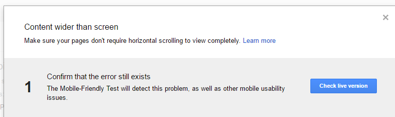
After solving the problem do not forget to run the Mobile-Friendly Test one more time by using the following tool from Google.